

radio buttons
This block is part of the Component UI group and was last modified in core v10.4.28.
radio buttons v10.4.28 Generates buttons based on the objects in a given array. Will set a field to a given value on click.
- buttons required
arrayButtons to be created. Should be the following format: [{ value, icon, text, style (optional), class (optional) }]
- default value
valueThe default value to be used if the value in the array is not set.
- default class
uiclassThe default class to be used if the class in the array is not set.
- default style
uistyleThe default style to be used if the style in the array is not set.
- active class
uiclassThe class to be set when the button is set to active.
- field required
fielddefinitionsField to save the value in
- validate
fieldvalidationApplies the given validation to the element, overwrites attributes given in the attributes popup
- event
clickevent
- uicomponent
uicomponent
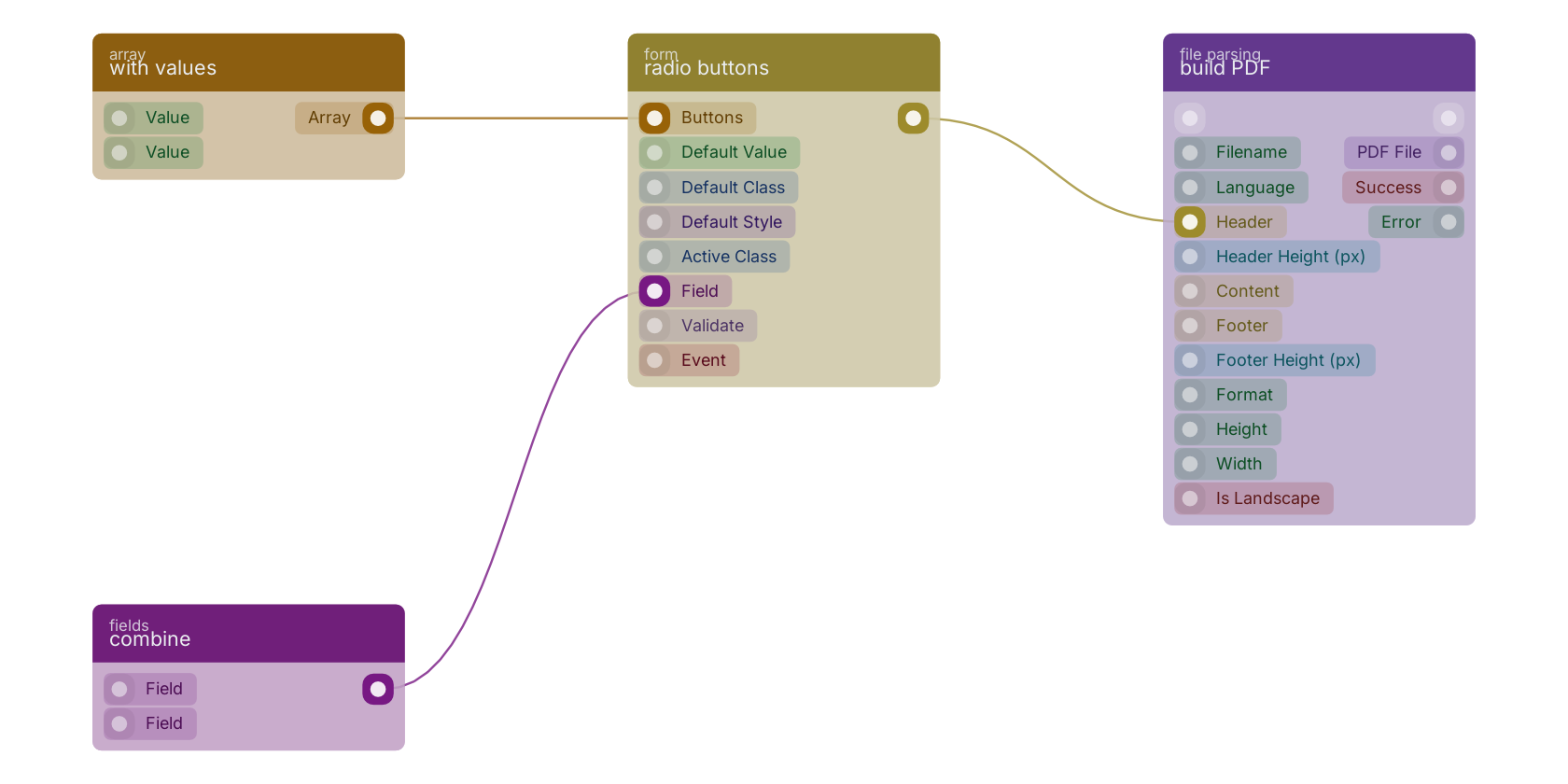
A typical wiring for radio buttons: with values feeds the array pin; combine feeds the fielddefinitions pin; the uicomponent out pin feeds build PDF.
Version history
Introduced in v10.4.28.
Back to
Component UI Return to the main group to view all sub-groups Back to form Return to the group to view all blocks within this group